Test Your Blog On Different Screen Devices And Resolutions
Have you ever considered how your site or blog might appear to your readers and visitors? I mean your blog may look good when you view it on your computer, but will it appear the same if you were to view it on a different computer (with a different screen resolution) or on a different device?
A blog with fluid-width templates stretches (or shrinks) as resolution changes. Columns or sidebars may lose their alignment, drop to the bottom or simply go out of sight in lower resolutions.
If you don’t know for sure how different screens and resolutions affect your blog, it might be a good idea to test it, especially in resolutions lower than your computer’s. No, you don’t have to use different computers to do that. You can do it online.
[Updated Feb 2013] Replace the old tool (no longer available) with a new one. Update mobile previewing to reflect changes in Blogger user interface.
Testing your blog
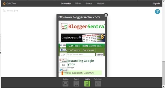
- To test your blog, simply visit Screenfly web page.
- Enter your blog URL and click Go button. Your blog will appear inside a frame.
- Select a device/resolution from the menu bar across the top of your screen. The iframe will be resized to match your selected resolution.
- Test with different resolutions and observe how your blog layout changes.

Note on smartphones
As you might’ve known Blogger has introduced mobile template a while back. If you’ve activated Blogger mobile template for your blog, it should automatically switch to mobile template when accessed using a smartphone. This resolution tester however, is a mere screen resizer; it will not cause your blog to switch to mobile template, therefore it will not show the layout intended for smartphones.
Update Dec 2013: Screenfly can now mimic the user agent of the devices you select using a proxy server. If your site/blog serves a different template for smartphones, just click the "Use Proxy Server" eye icon to see the mobile template in action.
Which resolution should you optimize for?
You can use the data from w3schools.com as a guideline. As of January 2011 most web users that visit w3schools use screen resolutions higher than 1024x768 pixels.
| Date (updated) | Higher | 1024x768 | 800x600 | 640x480 | Other |
| January 2012 | 85% | 13% | 1% | 0% | 1% |
| January 2011 | 85% | 14% | 0% | 0% | 1% |
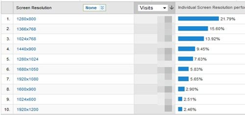
If you want to see data specific to your blog, open Google Analytics and go to Visitors > Browser Capabilities > Screen Resolutions.

According to Google Analytics, only 1.5% of visitors access this blog using resolutions lower than 1024px wide. That means this blog (at 960px wide), should look fine and remain user-friendly to 98.5% of its visitors.
How about your blog?
Enjoy!
26 comments to "Test Your Blog On Different Screen Devices And Resolutions"
This is a fantastic tool, thank you.
waduh bahasa inggris, Rusa gak paham e :D
*buka kamus*
That's impressive :)
Baru nyadar :D
Tapi apa daya saya gaptek HTML :(
wow... i just know resolution tester, thank you.
what a great and helpfull tool to test a fluid-width website
which i don't used, i always use fixed-width
Gak terlalu mikirin tampilan sih. Yang penting nulis
Thanks for sharing site that can show all the best resolutions of my website. So I can understand how it looks for other on different desktop resolutions
bisa untuk dicoba, makasih udah sharing informasi soal resolutiontester.com :)
Good info and very usefull for a web designer, thanks :)
Keren... Jadi bisa tau mana resolusi yang cocok buat websiteku.. :D
@Amri
Optimize your blog to 1024px wide and you'll make 98.9% of your readers happy :)
thanks for sharing this. I detected some errors on my blog in other screen resolutions. I just fixed it. Thank you for this.
Hello GL, very usefull site (resolutiontester.com), If I may, I'll recommend you to insert in this tutorial another usefull tip for site testing: browser compatibility - browsershots.org. I found this one, and it's ok. If you know another one I also want to know it :)
Hi there, my blog looks messed up on iphone screen resolution, but fine on 1400x900. Can't I fix one location for the gadgets so that on different resolutions it doesn't move and just gets re-sized? tnx
@Yvonne
You can activate a special layout just for smartphones: Blogger mobile template.
thanks green lava
Is it possible to use this on normal web sites. Thanks Vicky
@Victoria Froud
You can use it on all kinds of websites.
Thanks for taking the time to discuss this, really liked this article you have posted. i shared this on facebook.
This helped a lot!!
thanks for the post, i like that tool..
Nice article, thanks for the information.
A nice find mate. You can also use the[href="http://whatismyresolution.net/screen-resolution-test"]screen resolution test[/href] provided here!
There are many sites who let you view your webiste in your desired resolution.
thanks sir, But i have one query, which is- As blogger gives us the option of displaying mobile template for mobile devices, But in Screenfly i can only check the Responsive design, it does shows mobile template there.
How can i check that in which devices does, blogger mobile template is loaded.
or there is screen size set by blogger?
@Abhishek Sen
Click the eye icon on the menu bar. It will change the user agent to mimic the device you select.
Thanks for helping me out sir
Post a Comment
We love to hear from you! Leave us a comment.
To ensure proper display, HTML/XML/Javascript need to be escaped first using this escape tool.